
WORKS
Y-Tasu Inc.
A real estate partner that supports
your life as a continuous line, from marriage to inheritance.
01SUMMARY
Highlights of this project
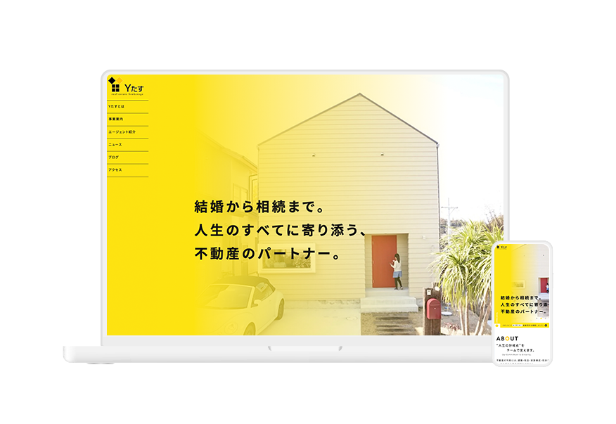
We wanted a corporate site that conveys the philosophy of "being by your side through all of life, from marriage to inheritance" and a sincere approach.
We put the diverse team of specialists (agents), including architects, financial planners, and counselors, front and center, and structured the site to convey the reassurance and trust that come with a referral-only model.
We implemented a custom editor and delivered the site so the client can easily update it on their own after launch.
02BACKGROUND / APPROACH
Background and Consultation
In building the site, we aimed to express this unique concept of "supporting your whole life as a continuous line," along with the company's sincere approach, through both visuals and content structure. We put the team of specialists (agents) with diverse backgrounds, including architects, financial planners, and counselors, front and center, designing the site to convey the overwhelming reassurance and trust of a referral-only model. We also implemented a custom editor so that the client can easily update the site on their own after delivery.
In the design, we used Y-Tasu's brand color, yellow, as the base, and balanced it with carefully chosen photos and illustrations so it doesn't become overpowering. We combined a refined cleanliness worthy of being entrusted with important life decisions with a warmth that makes consultation easy, creating a world where visitors feel comfortable and naturally move on to reach out.
How We Work
With the brand color yellow as the base, we balanced photos and illustrations so it never feels overpowering.
The design combines a refined cleanliness worthy of important life decisions with a warmth that makes consultation easy.
03PROCESS
Production Process
- 01Hearing
- 02Structure & Copy Organization
- 03Design
- 04Coding & Update Feature Implementation
- 05Launch & Operation Support
04OUTPUT
Deliverables


05CARE
What We Kept in Mind
A layout that shows the faces of the specialist team conveys the reassurance of a referral-only model.
Yellow as the base, with photos and illustrations for a warm, friendly impression.
A custom editor lets the client update the site themselves after delivery.
06CREDIT
Credits
Web Design / Yojiro Hashiguchi
Coding / Gen Goto